Turtle Power!
For those that don’t know – and that was me up until a few weeks ago – there is a monthly Community Art Contest held over on the Unity forums. The basic premise is that a theme is set, people have a month to produce something art related that fits with the theme, and you show off the results using Sketchfab.
What is Sketchfab? That’s a good question. Well Sketchfab is a WebGL powered platform for sharing and viewing 3D content online. Sounds pretty nifty, right? In order to try it out, and to practice a few new techniques, I decided to enter the October contest.
The theme for the month was ‘The Island’ and this blog covers the work behind, and results of, my entry.
Concept-ion
Within about 4 seconds of someone mentioning the theme ‘Island’ half of the known universe wants to put it on the back of a turtle. Ok maybe that’s an exaggeration, but the idea is certainly a cliché.
Even with that in mind, I still felt like there was room to do something that touched on the subject, but did it in a less obvious way. Given the time of year, making it a dead turtle seemed like the way to go.
But a dead turtle on its own isn’t an Island is it? Nope, that’s just a dead turtle. Islands need inhabitants. Feeling reluctant to commit to a character model, I decided that detailing the Island with things that implied the inhabitant was the way to go. Since I’m already using the sub-themes of ‘Halloween’ and ‘cliché’, it had to be a Witch!
Do 2 clichés make a… right? Who knows, I’ll let you decide!
Joining the Dots
With the concept set in stone, I started work on the modelling. First port of call was the island, specifically the skull of the turtle. This required searching out some reference images with the help of google and this was the end product:
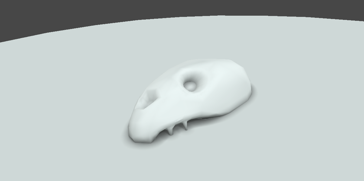
A turtle skull… kinda
It was a simplified attempt taken from noticing the huge variety of skull shapes across the various species and trying to find the middle ground. it wasn’t perfect, but I was happy enough and moved onto the rest of the corpse – shell, arm and tail. This required some more googling – turtle fins are fascinating things!
If anyone is monitoring my search traffic, at this point they probably think I’m trying to start a cult based on the satanic worship of turtle bones, with the aim of ascending to some demigod-turtle-avatar of Leonardo, Donatello or Michelangelo. If only…

RIP Mr Turtle
I opted to pose the island countering the rotation of the head, and with the arm raised on the right side to add detail to the ‘background’ of the main view. I like how balanced this felt and moved onto modelling the landmass on the shell – an island isn’t an island without land!
This was quickly followed by trees – created and exported from Unity – pumpkins, a cauldron, broomstick and dock. I Finally added the 2 torches to let me bring additional light sources to the scene, and the 2 candles for some finer details. A bunch of other fine details didn’t make the cut due to time – books, potions, cauldron effects, more foliage. I decided that there was ‘enough’ detail to move on, and that more time would be better spent on the texturing.
The end result looked something like this:
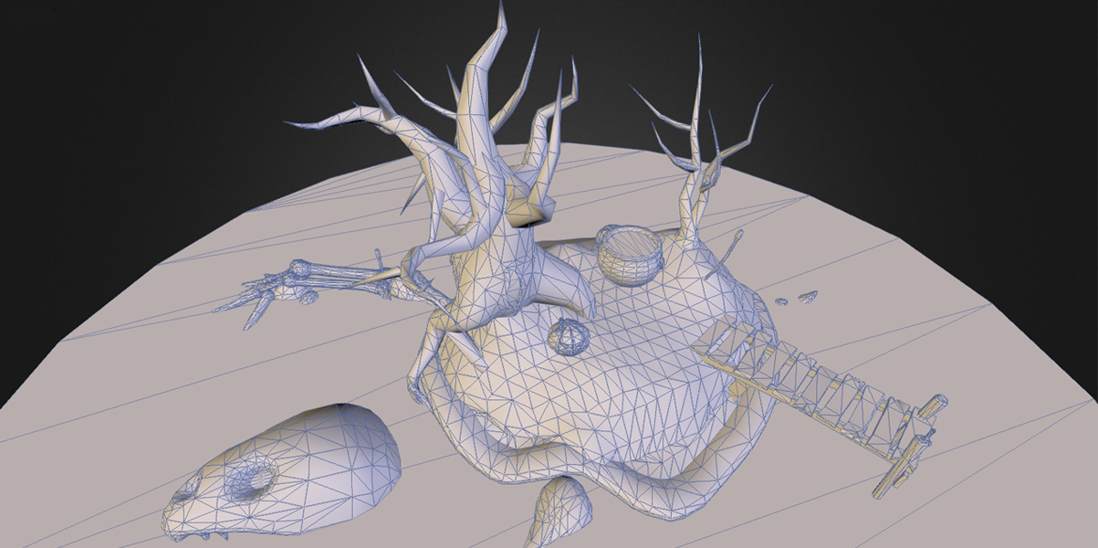
Front
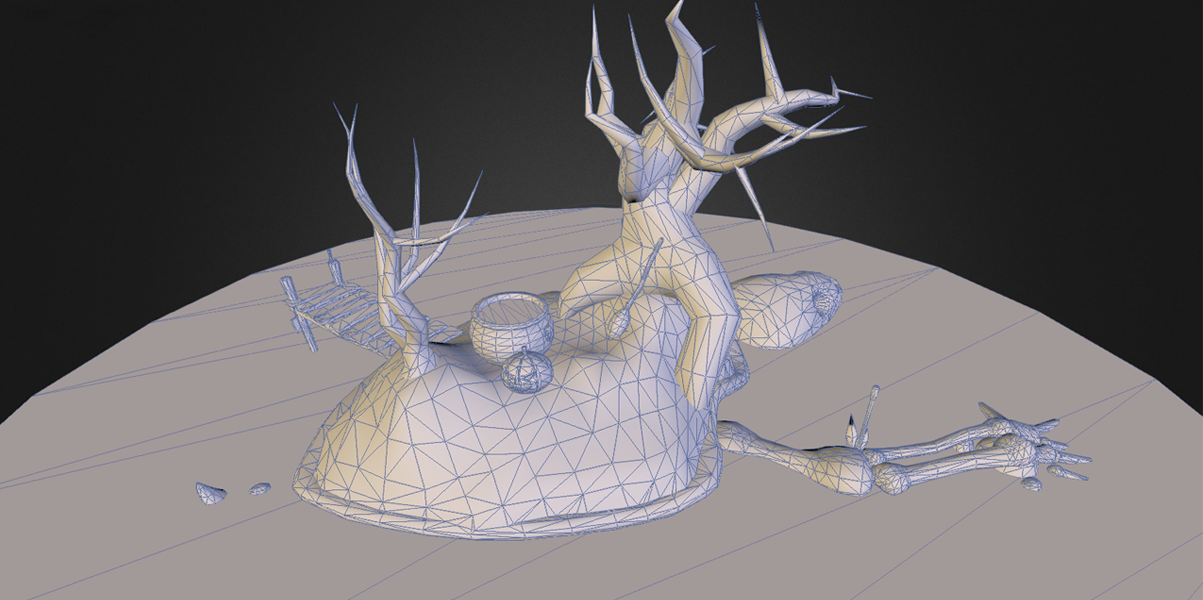
Back
Colouring In
Throughout the modelling process I’d be using a rough lighting setup to help me visualise and place things – before I moved onto texturing the scene I need to finalise the lighting. After doing some reading about Sketchfab and Unity, it seemed that the best course of action was to bake the lighting into the diffuse texture. Since I was doing my lighting in Unity, this meant combining the textures manually, a tricky process to get right.

Lighting vs Me – Round 1 – Fight!
My first attempt at finalising the lighting didn’t come out too bad, but as I added block colours to test it, I decided it was too bright for the atmosphere I wanted. In order to get a better handle on the lighting, the white had to go. So after blocking out the scene with some flat colours, my 2nd attempt came out much better:
Round 2… KO! Winner!
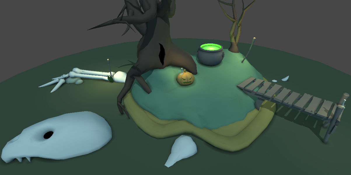
With the lighting finished, it was time to work on the texturing. Wanting to practice the style, I decided to go for a hand painted look. For what is often considered such a simple style at the end, I found hand painted textures to be a deceptively time consuming process. This was in part due to my inexperience with hand painting, and in part due to the very nature of the style – surface variation, highlights, shadows – every bit of it requires a lot of love and attention. I’m sure I could get better at this with more time, but I certainly have a new respect for some of the gorgeous hand painted texture work I see in games. It really is a labour of love.
Now realising the HUGE amount of work I had left to do, and the short time I had to do it (about 4 days), I pushed on with the texturing knowing that I would have to spend less time on it than it needed – I’d just have to hope the end result was still presentable!
Sketchy Business
Pencils down. Time is up. Hand in your work on the way out of class!
With a couple of hours left I put the finishing touches to my texturing, went back and forth over the final size of my textures, and submitted my entry. You can find it in full Sketchfab 3D glory below (or here):
Job done.
What Worked
Overall, I think the end result came out pretty well, but of course some parts came out better than others! Here’s my list of favourites – some are very specific, some are very general:
- Rocks – The rocks where one of the first parts I textured, and being my 1st handpainted texture, I’m quite pleased with how they came out. Just don’t mention the blend between the rocks and the shell…
- Water – For a completely flat surface, I think the water came out nicely, and carries the ‘murky’ swamp look quite nicely.
- Candles – Probably holding the highest vertex-to-size ratio of anything in the scene, and 3 second texture, I think the flames on the candles look great. The little bit of bloom from Sketchfab just adds to it!
- Concept – As a concept, I really liked my idea. Turtle islands are cliché, but dead-turtle-islands-that-are-home-to-a-sinister-witch? Yeah didn’t think so! There’s a self-five in here somewhere.
- Trees – The twisty, creepy, infesty vibe and the almost muscle fibre like texturing, made for some sinister looking foliage.
- The Dock – There just something about it that I like. I like how it looks in the light. I like how it meets the water. I like how the candle lights it. I like how the slight tilt to the right feels so much bigger than it actually is.
What Worked …Less
I’m a firm believer that you should be your own harshest critic – if you can’t see the flaws, or potential flaws, with your work you aren’t looking hard enough. Making mistakes is human. Ignoring them is stupid (and also very human). Learning to spot your mistakes is vital if you want to improve on them next time around.
With that in mind, these are the main areas I think I could have done better on:
- Grass – I’m not a fan of my grass texturing. It’s too ‘leafy’ and ‘repeaty’ for me, but luckily the darkness of the scene makes it less of an issue. I was pushed for time when I started the texturing, and having experience making grass textures before, I know I could have done better.
- Polygon Count – Or more specifically, Vertex count. There was a 50,000 limit for this context. I used 5300. Some of the areas that gave me the most issue with texturing could have been improved by adding more vertices to carry the detail. This is in part because areas like the Skull where modelled first, and I was overly cautious.
- Texture + Lighting – While I’m pleased with the overall look, combining lightmaps to diffuse manually and trying to achieve the same look was a pain. It also lead to the need to uniquely UV the entire scene. Now there is a lot of surface area in what I made, but I think I could have made the texture size smaller with some different choices.
- Time! – I left the texturing too late which was a bad call. especially so when trying out an art style I’m less familiar with. Handpainted textures take time! There was also a bunch of other model details I wanted to add, but didn’t because of time – Spell Books, Potions, Cauldron effects – all would have been great additions if I had managed the time better.
- Graphics Tablet – Mine sucked and died, so this is really a mouse painted texture. New tablet is on my Christmas list!
Conclusions
Sketchfab is good, I Genuinely like it. It’s a great service for showing off 3D artwork in a secure, clean and simple way. 3D art should be viewed in 3D – whether it’s for contests like this, portfolios, displaying work for critique, or even showing Work-in-progress to a Client or Team member (You can password protect models with a Pro sub).
It feels like there’s a place in the industry for a service like this, and with the additional features they keep adding, it could be Sketchfabs place. It’s definitely something I’ll use again in the near future.
Taking part in the contest was also pretty good. It gave me the chance to try out a few things, create a nice piece of work, and to check out what others could do in the same timeframe. Since art is never done – having a deadline is a good way to force it to be done.
As for my entry, I’m quite pleased with what I managed to produce and I think it matches my concept nicely, even if it does have its flaws. As long as my schedule allows it, I think I might have to consider entering the next contest too!
Update: It seems that my entry won the contest. Lots of great entries, so very happy with that result – Kudos to me!